 Click for larger version (PNG); click for PDF version. Click here for the list of dolls.
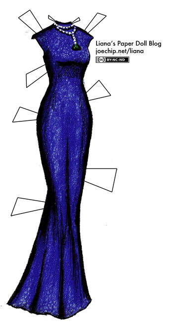
Before I start this very long entry, a quick reminder: the Oscar red carpet starts tomorrow at 7 PM EST. I’ll be livedolling – that is, drawing as many of the gowns in attendance as I can before my fingers drop off – and I hope you can join me in the comments section for discussing all the gowns and perhaps adding your own, if you like! Even if you don’t have a TV, you can join in: I can’t watch it live either, so when I’ve done this before I just kept reloading the Oscar-related pictures on Getty Images. It looks like it’ll be streamed online at AP Live, so I will be trying that, too. I may be able to break my record of three in one night, due to the time difference…
I’m fairly well versed in English color names – especially those of the 146 Prismacolors that I’ve been using for over a decade – but in Japanese, the closest I get to sophistication is popping the words for “dark” and “light” in front of the basic color words. To fix this, I thought that I could learn some obscure Japanese color words, which would both brighten up my impoverished vocabulary and provide an opportunity for some cute drawings.
I started with the book Kimono and the Colors of Japan: The Kimono Collection of Katsumi Yumioka, which is both in English and Japanese and has a paragraph of information on sixty traditional colors, with a gorgeous picture of a kimono to illustrate each one. I also picked up 日本の伝統色 The Traditional Colors of Japan for my birthday, which has a sentence in English about each color but is primarily written in Japanese and has information on 250 colors. It also gives CMYK, RGB and hex code values for each color, meaning I can figure out easily what the nearest Prismacolor shade is with the Prismacolor Digital Color Coordinator.
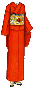
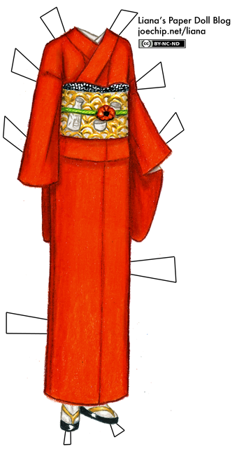
The first color in Kimono and the Colors of Japan is 猩々緋(shōjōhi), a warm, cheerful red with a touch of yellow and a hex code of #E83015. Both books translate this as “poppy red”, and conveniently, the Prismacolor color picker tells me that the closest Prismacolor equivalent to #E83015 is Poppy Red. To my eyes, it looks like it could be either Scarlet Lake or Poppy Red, and that Poppy Red is just a touch too orange, but I have a feeling they will not all be this easy, so for now I’m accepting the coincidence.
The color is produced with dye made from the female cochineal insect, and it first showed up in Japan during the Warring States Period (1467–1573), when thick woolen fabric dyed poppy red was first imported from Southeast Asia. Japan was at civil war at this time, and many feudal lords had their battle surcoats (陣羽織, jinbaori) made out of this material, because it was thought that the color protected the wearer from arrows or bullets. (For an example of these battle surcoats, look at this reproduction of Oda Nobunaga’s surcoat.)
Let’s break down the kanji in 猩々緋. On its own, 猩 means orangutan, and the Japanese word for orangutan used to be 猩々 (shōjō). That’s because the animal was named after the 猩々 (shōjō), a mythical Chinese creature or spirit that was said to live on the coasts and enjoy drinking. It was said to look like a human, or like a monkey with a human face, with brilliant red hair and a face red from drinking too much, and according to one account its blood was thought to be what lent the fabric its protective qualities. The shōjō is also a character in a Noh play, Shōjō Midare, and the actor wears a shaggy red wig, a red mask and red clothes. If you look 猩々 up in a dictionary, one of the definitions is “someone who loves to drink,” but when I asked some of my Japanese friends, that usage doesn’t seem very common these days, so it is just an interesting, random fact; don’t put the term into practice unless you happen to hang out with a bunch of Noh enthusiasts. Incidentally, it is not very clear if the color name was simply named after the creature, inspired by its representation in the Noh play, or if it gained that name specifically because the dye was said to be taken from the shōjō’s blood or hair: all of my sources have something different to say about the matter. (It seems like the story about the dye coming from the blood is pretty common, but it could have gained the name first, and the stories about the blood and its protective properties, later.) One story claims that leaving sake out on the beach will tempt them to try it, then get drunk and fall asleep; from there, it’s a simple matter to extract the blood needed for the dye.
Of course, it’s not in the official list of kanji that Japanese students have to learn (常用漢字, jōyō kanji), nor in the list of kanji that may be used in names (人名用漢字, jinmeiyō kanji), and it only shows up in a few other words, so a kanji like that does one little practical good. So all of this detail is great fun, in my opinion, but those of you out there learning Japanese, don’t trip all over yourselves to practice writing it. (If you actually want to write orangutan, 猩々 is way overkill – the word you would be looking for is オランウータン.)
The middle kanji, 々, just indicates that the previous kanji is repeated. That is, we could also write the color name as 猩猩緋.
The last one, 緋, is slightly more useful than 猩, as it is also seen in other colors such as 浅緋 (asahi, light scarlet). This kanji indicates a deep, bright red. It’s not on the list of kanji that are commonly used but it is on the list of kanji that may be used in names. It shows up in a couple of other colors in Kimono and the Colors of Japan, so we’ll remember that one.
For today’s kimono, I’ve done a poppy red iromuji (色無地), which is a formal, unpatterned, single-color kimono worn by both married and unmarried women. (I’ll write more about the various types of kimono in the future, but I have had this entry mostly written for some time, and I wanted to get on with it.) The obi is decorated with a stylized wave pattern (青海波, seigaha) in gold and white, plus a sake (Japanese rice wine) bottle and cups, as a reference to the shōjō; as a nod to the English name of the color, the obi-dome (帯留め), which is the piece of jewelry in the middle of the obi, is a poppy. (That would be ケシ, keshi, in Japanese. Incidentally, poppies seem to be rather rare motifs for Japanese textiles; they were introduced in the Muromachi period, so it’s not like the flower was unknown, but they don’t have symbolic significance that I’ve found; perhaps the connection with medicine or opium was too strong to make it a desirable decoration for a kimono?)
Besides Kimono and the Colors of Japan and 日本の伝統色 The Traditional Colors of Japan, I also referred to Symbols of Japan: Thematic Motifs in Art and Design, The Colors of Japan and Japanese Art Motives. The story about trapping shōjō with sake is from the 1912 “Scientific Temperance Journal.”
I’ve tried to stay away from relying on online sources, but the detail about shōjō blood being thought to have protective properties was too good to pass up, and is from this page. For further information (in Japanese), you can also look at http://www.colordic.org/colorsample/2011.html, http://yuzen.net/color/red/shojohi.htm, and the Japanese Wikipedia page on 猩々緋. For you kanji fanatics out there, you can find all the details about 猩 and 緋 on Denshi Jisho.
Now, “poppy red” is the first color in Kimono and the Colors of Japan, but if I go in order all I’ll do is red, red, red, and I’ll get bored. I’ve picked five colors at random from the table of contents of Kimono and the Colors of Japan. Which should I do next?
Prismacolors used: Poppy Red, Crimson Lake, Tuscan Red, Cream, Sunburst Yellow, Yellow Ochre, Goldenrod, Bronze, Sepia, Apple Green, Chartreuse, Kelly Green, French Grey 10%, 20%, 50%, 70%, Black, Cool Grey 10%, Sakura Soufflé White Gel Pen
 Share
Share Click for larger version (PNG); click for PDF version. Click here for the list of dolls.
