 Share
Share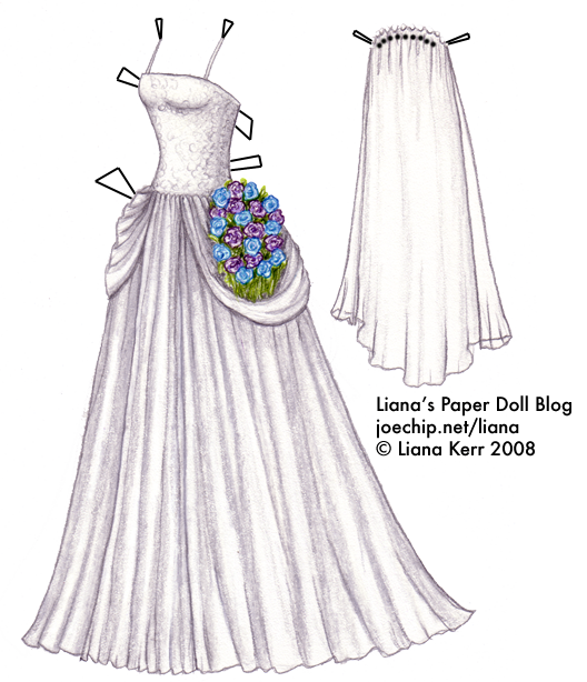 Click for larger version; click for the list of dolls.
Since my 1940s wedding dress attached to a rant on For Better or For Worse is one of the more popular dresses on the blog, I feel like I should bring the saga to a close. Dee ended up altering the supposedly sixty-something-year old dress into something reasonably modern, the Ghost of Grandma made up for fanciful logic on the part of the cartoonist, the flowers were hideous and Liz ended up marrying that creep. All the way up until the vows were said I was hoping Liz would come to her senses, but immediately after that scene I was so over the whole thing, as evidenced by my putting off the dress for four months. If the end of the saga was boring its weird rebirth is mind-numbingly dreary, although sometimes I visit the Foobiverse!’s Journal out of nostalgia and their second-hand psychoanalysis of Lynn is amusing at times. I still follow Foob’s Paradise, though, which is a webcomic that continues the Pattersons’ adult lives.
Since I get so many search queries related to weddings, I’m thinking of doing some sort of “wedding week” perhaps, maybe after Christmas. If you have any pictures of wedding dresses you just love, feel free to post links in the comments so I can get inspired!
The Good Queen is so far holding her own over the other dead queen and the rest of her competitors. She would say that’s only the way things should be, but it’s not over yet. I will do a bonus costume or two for whoever wins, so if you adore one of them get your vote in, send your friends over, post to your weblog and beg your readers to vote for your favorite!
