 Share
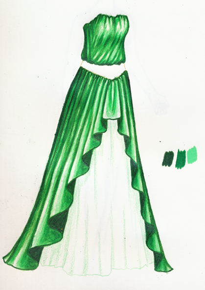
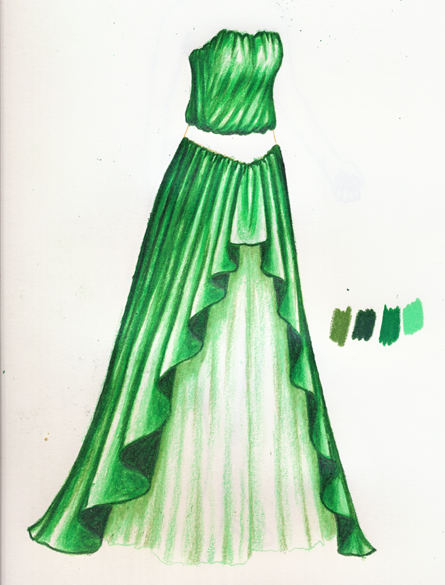
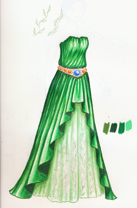
Share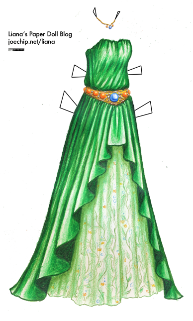 Click for larger version (PNG); click for PDF version. Click here for the list of dolls. I draw pretty much everything using Prismacolor pencils, and one thing I’ve intended to do for, well, longer than I might care to admit, is a basic tutorial on how I use them. Now that I’m feeling guilty about having neglected my page for half a year, I’m finally, finally going to show you how I shade my dresses! Let’s get a little music going, that’s crucial. If I get really into drawing I like something I can sing to while I work, but I’m interrupting my work to scan and write the tutorial, so today it’ll be Bound Together, a remix of music from the SNES game Earthbound. (If you want the full following along experience, here’s my favorite track: SnowBound.)
This turned out to be extremely long, so please click “read more” to see the rest!
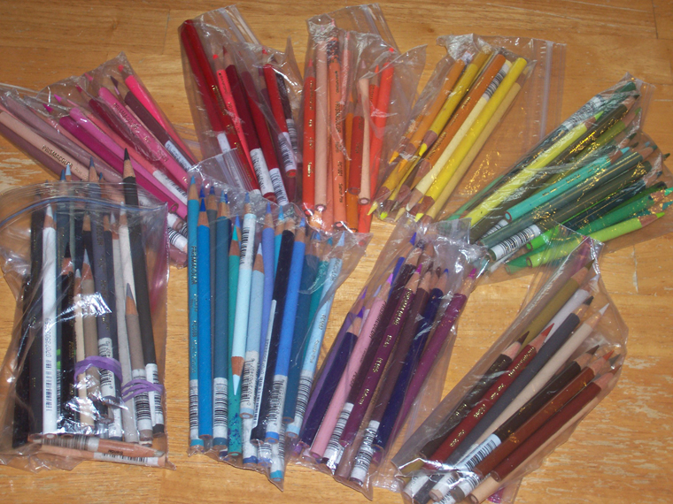 Have you ever wondered how a person keeps 146 Prismacolors in any kind of usable order? Well, now you have one answer. (Not shown: my bag of spares, my Verithin pencils or the little nubbly pencils that are too short to sharpen, but I can’t bear to throw out.) My mom has an extremely cool Prismacolor holder that she made herself, a long, flat sheet of fabric with a space for each pencil organized by serial number that rolls up into a nice, easy-to-carry little package. I admire that kind of organization. But for my own part, as you can see, I keep it at a distance. The sandwich bags work for me, but I wish they were a little bigger because the long, freshly sharpened pencils have a habit of poking out the sides.
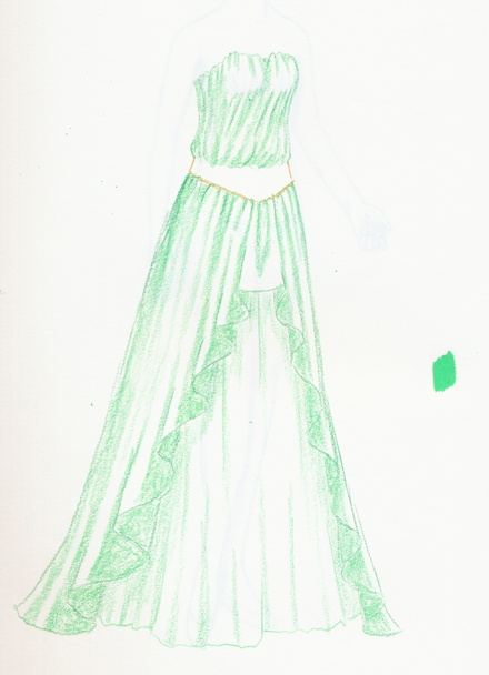
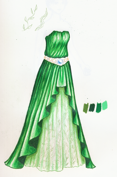
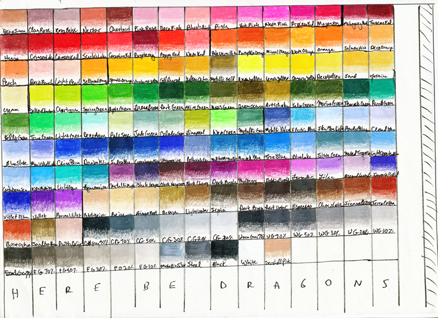 So how do I actually decide which green (out of the 24 colors I classify as “green”) to use? My color selection starts with this paper, which is very loosely organized by the same color groups that live inside each plastic bag. Almost everything I do boils down to choosing a dark color, choosing a light color, and choosing the color (or colors, but more often than not just one) in between that ties those two together, so this paper helps me see what the colors actually look like on the page and what three are most likely to work well together. Today, the overdress will be a classic three-color combination: dark green, grass green and light green. The underskirt will be kelly green, light green and white. (Certain parties felt that yesterday’s dress wasn’t green enough, so…)
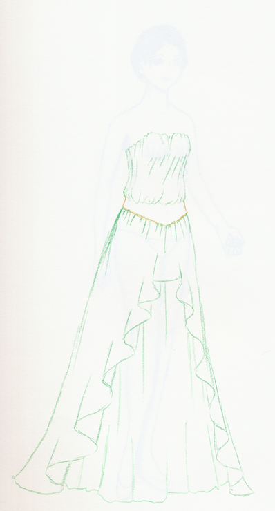 I’ve sketched out a basic gown using grass green, light green for the underskirt and goldenrod on the belt. (If you’re thinking “In what universe is this considered ‘basic’?” just remember I started drawing paperdolls when I was around fourteen. I’m 28 now, which means I’ve had more time to practice dashing off dresses like this than many of my readers have been alive.) The reason I chose these colors is that they’re not too dark and not too light; also note that they’re very lightly sketched, not firmly drawn. That means I can see them, but there’s a little wiggle room in there: by the end, the final outlines will be a darker color, and a lot of these first lines will hardly exist. (Look, you can see Ivy’s stunt double under there. She has short hair so I can see her neck and shoulders, and it looks pretty cute. She never had a name until now, but there are lilacs on my table here, so I’ll call her Lilac.)
 Generally, I like to start with the lighter colors, because you can usually make an area of a drawing darker, but desperately trying to lighten up a dark part of a fold with a white pencil just looks sad. Everything that’s going to be dark here — the left part of the dress, the deeper folds, the undersides of the folds on the front of the skirt — starts with an application of Light Green. The pressure used at this point is quite light. I added a square of Light Green drawn with full pressure for comparison. Also, I’m thinking about my light source when I lay down the first layer of color: for me, with this doll, it’s always up and to the right. I used the same color to start shading the underskirt, but there are two differences: I used just a little less pressure there, and unlike the overdress, that part isn’t going to get much darker. So it looks a little bland right now, but trust me.
 Grass Green comes into the picture now: I’ve laid it lightly over the Light Green areas that are going to be more deeply shaded. I actually haven’t put any Grass Green anywhere that wasn’t colored Light Green first, except for a couple of areas that are going to end up really dark anyways. Now, when I look at this, I think I didn’t put down enough Light Green, and that if I don’t add more now, the end product is going to look really shiny and dramatic because of the contrast between all the white and the darker shades that I haven’t put in yet. That can be good, too, but I want a more even look, so I’m going to add more Light Green.
 Now it looks more green than white to me, but the white parts are still present. Eventually, using the colorless blender will make those white highlights more subdued, so if you want a shiny effect, you want to leave a bit more of them than you might think. In this stage, I haven’t just added Light Green to the white parts, but also to the darker parts as well, lightly going over the areas where I added Grass Green last time. The more layers of color you have, the richer the final color will be, and the easier it is to use the colorless blender.
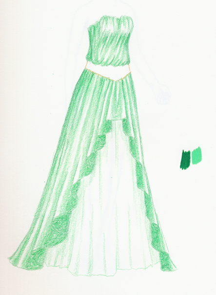
 The Light Green was overpowering the Grass Green, so I added more Grass Green. You can hardly see how the folds in the front work, now, so you just have to have faith in the upcoming Dark Green here. At this point, since there is already a strong base of Light Green, and I have a good idea of where the folds and highlights are, I’m using the Grass Green slightly more boldly, but still the strokes are very light and short.
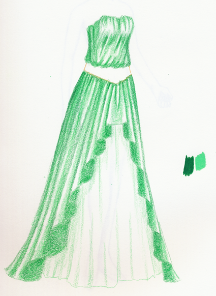
 Time for the Dark Green! At first, I’m going to go light on the Dark Green, because it’s easy to overwhelm the other colors. For now, I won’t be covering space like I did with the Light Green and the Grass Green: I’m just redefining the edge lines. To create a good, strong line I’m pressing harder with the Dark Green than I did with the other colors, and my pencil is nicely sharpened at all times. So in a way, we are back where we started, with nice, clear edges. (This is something you don’t have to worry about, of course, if you outline with ink or something similar right from the start. That’s fun, too.)
 Now I’ve made my lines clearer, I’m adding dark color. (I split this part up a little too late, as you can see from the previous image). The parts which are going to be dark are the edges on the right and left (the left will be notably darker), the folds on the skirt and the underside of the folds on the front. Since I know those folds on the front are just plain dark, I’m coloring those in with much more pressure than I’m using in the other areas.
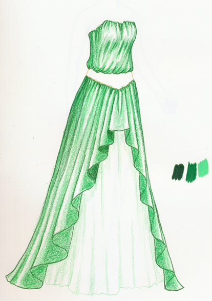
 At this point, we have a nice number of thin layers of color, markedly darker areas and areas I haven’t touched that will stay as highlights, and there’s not too much more I want to do. That means it’s time for my favorite part, the Colorless Blender! The colorless blender makes such a big difference in how the colors flow together, I worry that when you all see the difference between the before and after pictures, you all are going to think I’m a right old fraud… I always start the blender in the darker areas, pressing fairly hard from dark areas to light ones using small strokes. It sort of pushes the color into the lighter areas, which is why you want to keep the light areas untouched: the blender softens them automatically and makes them less prominent. It mixes the colors together, as well, which is the purpose of the multiple light layers. You can see some places where I laid down Dark Green without having a base of Grass Green and Light Green underneath it, and it looks jarring. As you can see, it fundamentally changes the color; this blended green seems to have a slightly warmer, yellowish feeling to it. There are some colors that look entirely different with the colorless blender, actually. Finally, the Colorless Blender makes a lot of little waxy shavings, so don’t use it in front of your laptop because they get in the keyboard. I just got a new laptop because the screen on the old one was about to go out (and it was pretty old anyways), but I bet that the old one was about 10% blender shavings by weight…
 OK, it’s pretty now, but kind of flat. With the Grass Green, I redefined some of the shaded areas, pressing pretty heavily: once you use the blender, you can’t really go back and add more light layers of color. From here on out, there’s not much subtlety.
 Same thing with the Dark Green: pressing heavily, adding more shadows.
 After adding more Grass Green and Dark Green, I don’t think it looks so flat, but I do think that the folds on the front of the overskirt don’t have a lot of impact anymore. This is dangerous, but I’m gonna do it – I’m bringing in just a little black to make them dark. I’m layering on the black really lightly. This can be tricky: if your dark color isn’t dark enough, black can be way out of place, but there’s a point where it gets too dark and then you can’t really do anything to make it darker. But in this case, the folds already have enough layers of color on them that a light application of black works really well. I also added just a touch of black on the edges and some of the folds.
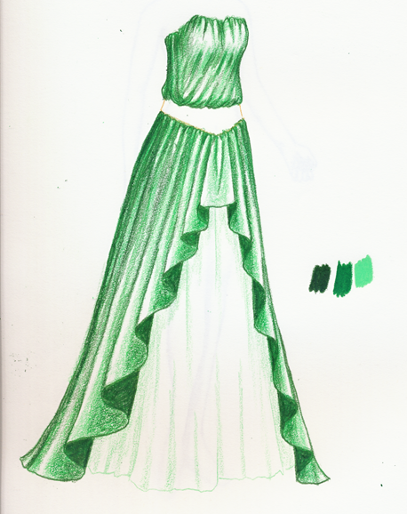
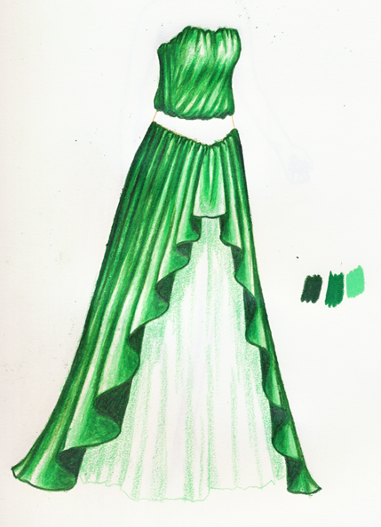
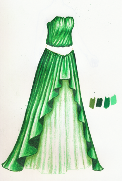
 Using a well-sharpened Dark Green, I went over the edge lines one last time. I think at this point I’m calling the overdress done.
 Back to the underskirt. I said “trust me” up in Step 2, but now it looks way too pale to me, compared to the overdress, so I added a little more Light Green.
 I’m not actually going to layer on White here, like I would with a color, because I don’t think it adds much. Instead, I’m going to add a little more definition with Kelly Green. The most important part to add shading is between the overskirt and the underskirt, so it seems to have some depth. However, if you make shading between two layers like that too dark, it just gets muddled, so take care.
 For now, I don’t want to make it much more darker or lighter, so time for the colorless blender again. Because I’m using less layers of lighter colors, it’s not as effective, but it still does a good job. By the way, I’m going over even the white areas with the colorless blender here. You’ll see why, shortly.
 Just a little bitty bit more Light Green…
 … But a little stronger hand with applying the Kelly Green to the shadows.
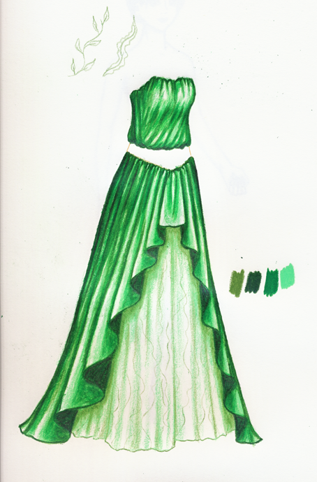 Now, I’ve been doing this adding patterns to open space thing a lot lately, so I want to add that to the tutorial. It’s basically just drawing patterns with a regular, very sharp Prismacolor over a base that’s already been shaded and had the colorless blender applied all over to it. Think first about what you want to add: this dress strikes me as vaguely mermaidy, so I’m thinking a sort of seaweed pattern. Using a color about as dark as the darkest part of the area you want to add a pattern to (so in this case, Kelly Green again), just draw your pattern out lightly. Don’t worry too much about making it conform to the folds – if the folds are complicated enough, and the pattern small and light enough, it doesn’t much matter. Here’s the beginning of my seaweed pattern… (Also note that I redefined the hem here, with Kelly Green.)
 It’s harder to draw over areas with more color layered over them; sometimes you just have to settle for the suggestion of a pattern. And you can see, in some areas, where I didn’t go over it with the colorless blender very well, the color becomes more thick, and not faint like the rest of the areas. So be careful with the balance of color layering.
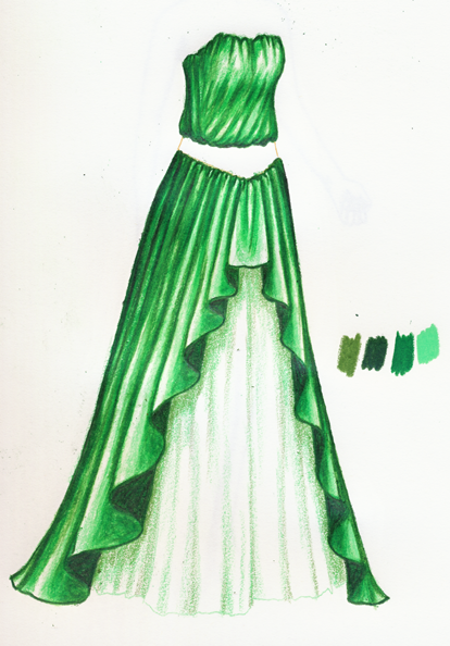
 I’m not quite satisfied with that, but I will finish the rest of the decoration and revisit it. Let’s move on to the belt. This dress is so green, it needs a little warm color to liven it up a bit. The belt will definitely be gold, but I’m also thinking different-colored cabochons and pearls set in it. The colors used here are Mineral Orange, Mediterranean Blue and Warm Grey 30%. (I think Warm Grey has the least personality of the three choices I have for grey, so it works here.)
 Cabochons are easy: darkest color on one side, highlights on the other, color in between. Darkest color here is Mediterranean Blue…
 Lightest color (besides white) is Sky Blue Light…
 And I think a little Caribbean Sea in the middle.
 A little more Mediterranean Blue to give it more shape, and it’s set.
 … Well, why not? Just a touch of Denim Blue, and a wee bit of messing around with the other colors.
 The orange gems get the same treatment, with Pumpkin Orange as the darkest color, then Mineral Orange, Pale Vermillion and Yellowed Orange as the lightest one.
 Just a touch of the colorless blender smooths them out (especially the edges), but it’s very easy to destroy your white highlights here, so be careful.
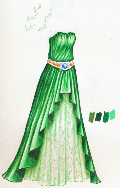 A little more dark color on the orange ones to counteract the flattening effect of the blender, and then the pearls. Pearls, at this level of detail, are simple: a strong grey outline, a small grey shadow, don’t touch the rest of it to keep it clear and white. I re-outlined them in Warm Grey 50% and used 30% for the (tiny) shadow.
 Because of the complexity of the gems, the gold part of the belt is going to be simple: a little line above and below the gems, but not much other detail. Starting with Light Umber, I’m drawing the line and filling in the area closest to the green cloth.
 With Bronze, I deepen those lines and filled in areas, and also shade right under the pearls and gems (not all the way around, you note).
 If this was just gold, I would probably use more colors, but since the gems are also there I’m going straight to the Sunburst Yellow. I’m leaving a lot of white in the two line areas, to suggest highlighting, but filling in most of the belt.
 Looks too flat to me – let’s bring in the Dark Umber. It’s easier to use dark colors in small areas after other colors have been layered on, because you have to work harder to make it dark, so you’re less likely to make it so dark that it stands out and looks unnatural.
 I’m happy with the belt, now, and the over-dress, but the underskirt? Boring. I’m going to start with making the seaweed stand out a bit… Back to the Light Green and Kelly Green. Hmm…
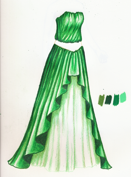
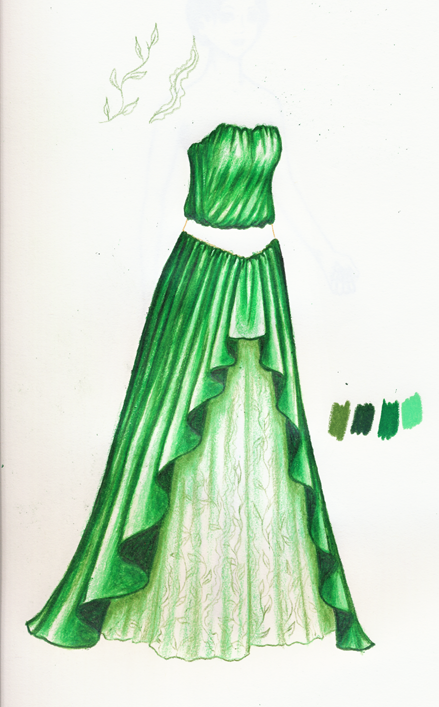
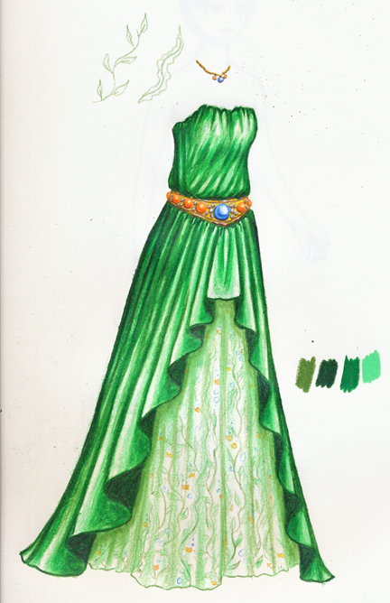 Of course! I know just what it needs. I’m sure you’ll agree with me that a little fishy pattern is a huge improvement. I also added a quick necklace and deepened the green shadows in the underskirt just a tad.
So there you have it! That’s how I do things. I leave you with the printable version, and with this conversation between me and my husband:
Brian: “So you’re basically giving away the shop?”
Me: “Nah, even if someone starts off using my style exactly, they’ll figure out a way to make their own style out of it and make it even better.”
Brian: “So it’s like a Shading Sorority?”
Me: “What if a guy wants to try it?”
Brian: “Then we’ll have a Greater Shading Society instead!”
I look forwards to welcoming you to the Greater Shading Society!
Wow… that’s a great tutorial! Awesome pictures and description.
I like the dress too. Very nice.
Monica
thebestpaperdollblog.blogspot.com
Dude! That is a great tutorial. I will have to try this. To be a member of the GSS is something to aspire to. btw-perhaps a little too green…
Thank you so much for this! I have a love hate relationship with my Prisma colors and am always trying to get them to work like yours… Now perhaps I can! ^-^
Wow, beautiful! Ive been a reader/lurker of your blog for a while now but never left a comment. Im so glad to see you back, Ive been checking everyday eagerly awaiting something new.
The tutorial is amazing as well, I love seeing how you slowly develop your dress and the way it builds up to the masterpiece we see.
Awesome work and I cant wait to see more.
P.S that is very very green.
THANK YOU THANK YOU THANK YOU!!!!! I’ve so totally been waiting for a post like this!!!!!
Actually, turns out that it works with crayons too. (I have prisma pencils, but I was just experimenting the technique and the prisma pencils cost A LOT, so I used crayons and my wrist turned out sore cuz I did it super fast cuz…yeah)
It’s amazing! It’s graceceful, elegant, you’re so talented!!!
I have only forty some prismacolor pencils, do I need more to begin? I love your blog it’s very inspirational to me and I adore all your wonderful creations!
Thanks everyone! I’m glad it helps! (And I’m glad to know you can do it with crayons, too. That kind of sounds fun…)
Kelly, actually, you can do almost as much with 40 Prismacolors as you can do with 140. It didn’t really take me that many colors to do this dress, as you see — I think around 10. Having so many just gives me more flexibility, that’s all. As long as you learn how the colors respond and how they work with each other, you’ll be able to do a lot with 40!
Liana— Does the copyright cost any money to get?
Monica
thebestpaperdollblog.blogspot.com
ooohh!!! thats what i was doing wrong… well in a matter of speaking.. i kept using a stupid pencil to do the outline and i only used one crayon to do all the shading on my dresses instead of using dark, medium and light colors.. thanks sooooooo much, ur a lifesaver!!
I never knew that you could do so much with just a couple prismacolors!
Wow I wish I had the patience for that. Not to mention all I have are crayolas and rose art. Thank you though, maybe I can get a few of these steps in between finals.
This is cool. But, will you be posting Ivy’s stunt double?
If u have time, enter in this site
http://www.i-dressup.com click in fantasy icon
the fairy dresses are fantastics!
one word only : “WOW”
Thanks, Liane! This is fantastic! What kind of paper do you usually use?
Thanks, everyone!
Sorry I overlooked your comment, Lindsey — I really should, she might come in handy for someone…
Megan, I use Strathmore sketchbooks, 400 series. But mostly out of habit, I’ve basically always used them. If they changed the color of the cover, I’d be sunk and wouldn’t know what to buy ^^;;
WOW! Thank you so much, that’s so helpful. it shows how much time and effort you take into making these dresses
You can to try indian style also but very cool dress
Nice.