 Click for larger version; click for the list of dolls.
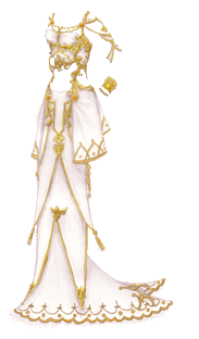
So I started playing Final Fantasy XII again recently. (It works nicely with my job. For my fifteen minute breaks, I do dishes and pick up, and on my half-hour break I go beat up some skeletons.) I think the thing I love most about the game is the lushly textured world design… everything is just so pretty. Funny, then, that I don’t really like the character designs for the main characters, except Fran and Balthier. (Don’t get me started on Penelo’s weird leather wings … or Ashe’s little sailor collar… or Vaan the most well-dressed orphaned urchin ever … or Basch’s potholder) I was thinking that I should paperdoll the NPCs, because each major area has its own style, and the female townspeople always looked really cool to me, especially the Arcades women. Luckily, I found a great Ashe shrine that has screen captures of the dress, plus the original concept art, which meant I got to abandon my half-hearted sketch of her regular costume and go for this one instead!
This is Ashe’s wedding dress, and you see it in the very first part of the game, followed soon after by her mourning dress. If I didn’t do the wedding dress, I’d have done a white dress she wears that I also liked, which as it turns out is just a white and grey version of her mourning dress. Maybe another day…
Scanner messed this one up too, but I fixed it up well enough. Does anyone have any idea why it does that? It scans intially sort of softer and the colors are true to the page, then when the scan or preview is done, the colors get more saturated and it looks kind of like someone ran a sharpen filter on the whole thing…
 Click for larger version; click for the list of dolls.
 Share
Share